How To Setup and Use Reown Analytics To Grow Faster & Smarter
Understanding how users engage with your app is just as critical as building the app itself. Teams want to measure growth, track activation campaigns, and improve retention. But doing so often means stitching together onchain data, wallet logs, and third-party tools.
Reown AppKit Analytics, accessible through the Reown Dashboard, solves this by providing a clear, chain-agnostic view of user activity. From monitoring active users across wallets, to mapping chain distribution, to segmenting new vs. returning users, Analytics equips teams with actionable insights to prioritize ecosystems, optimize onboarding, and measure the real impact of growth initiatives - all without the overhead of custom solutions.
In this guide, you will learn how to:
- Set up a project in Reown Dashboard.
- Use the AppKit Analytics feature.
This guide takes approximately 10 minutes to complete.
Let’s get started!
Pre-Requisites
This section walks you through the key prerequisites for using Analytics with Reown AppKit.
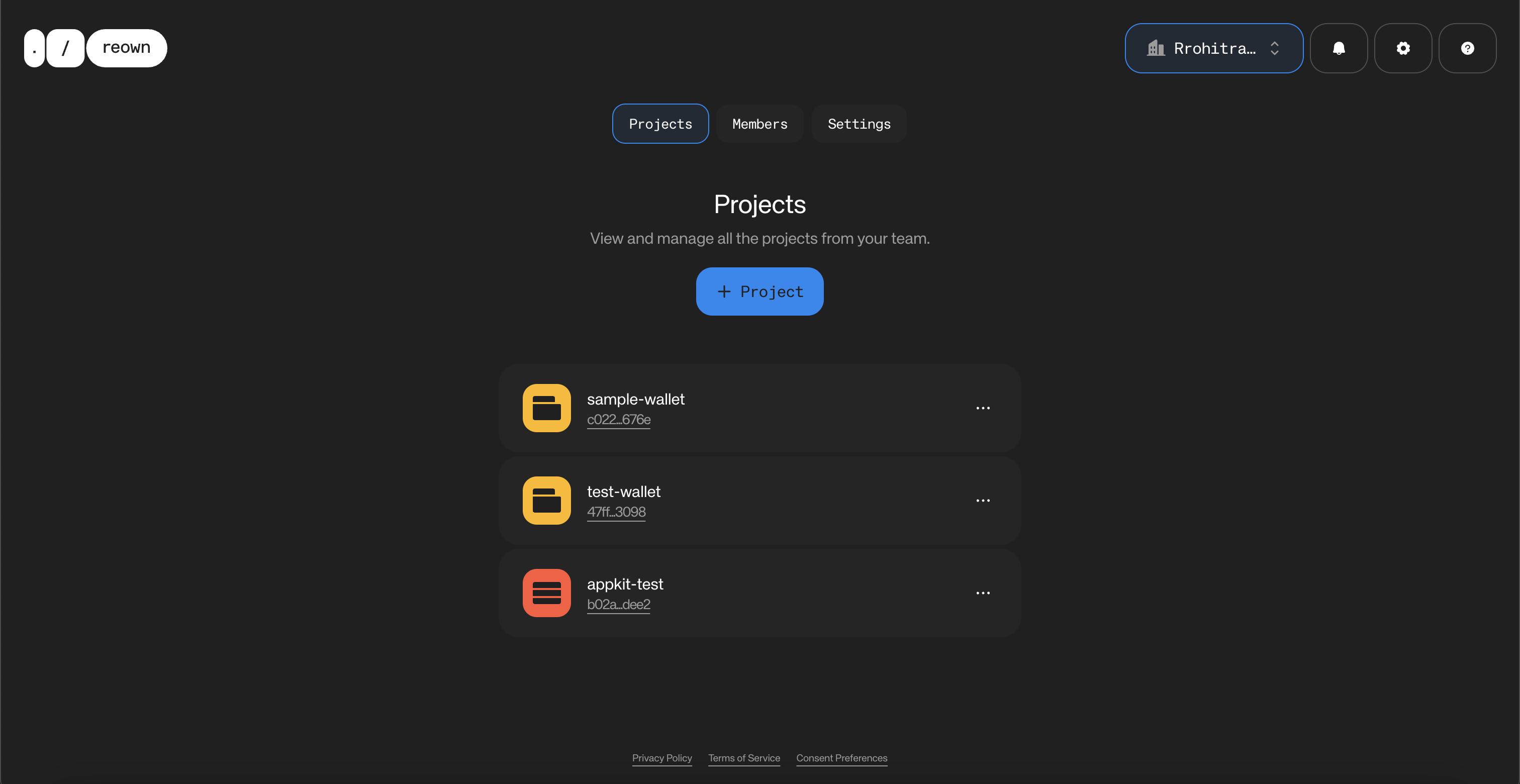
Create a New Project on the Reown Dashboard
Reown AppKit Analytics collects and aggregates data to help you track the growth and performance of your Web3 app over time. To ensure everything works as expected, you’ll need to configure your project with the correct Project ID. You can obtain this ID from the Reown Dashboard and add it to your Web3 app when integrating Reown AppKit.
If you haven’t done this, then you will need to create a project ID, configure it with Reown AppKit in your Web3 app, and wait for users to use your app before you can view analytics on your app.
First, you need to get a project ID from Reown Cloud that you will use to set up AppKit with Wagmi config. Navigate to dashboard.reown.com and sign in. If you have not created an account yet, please do so before we proceed.
After you have logged in, please navigate to your team’s section of the Cloud Dashboard and click on “+ Project”.
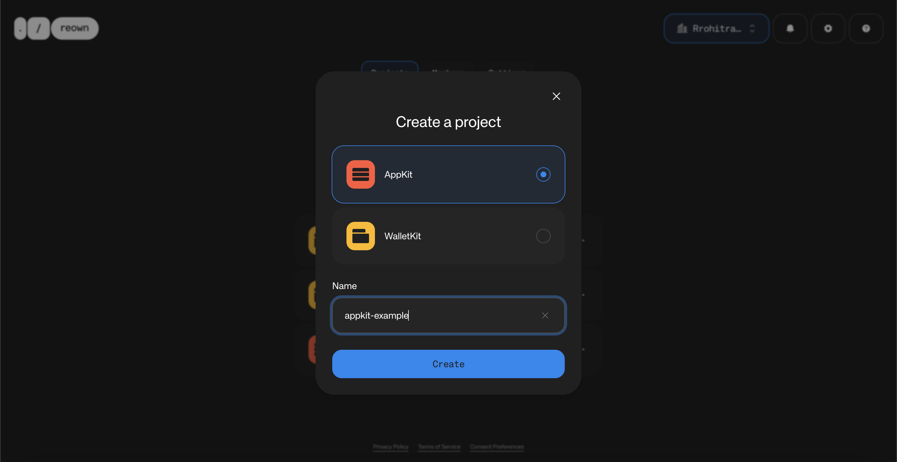
Now, select the product as “AppKit” and enter the name for your project. Then, click on “Create”.
The Dashboard will now create a new project for you, which will also generate a project ID. You will notice that your project was successfully created.
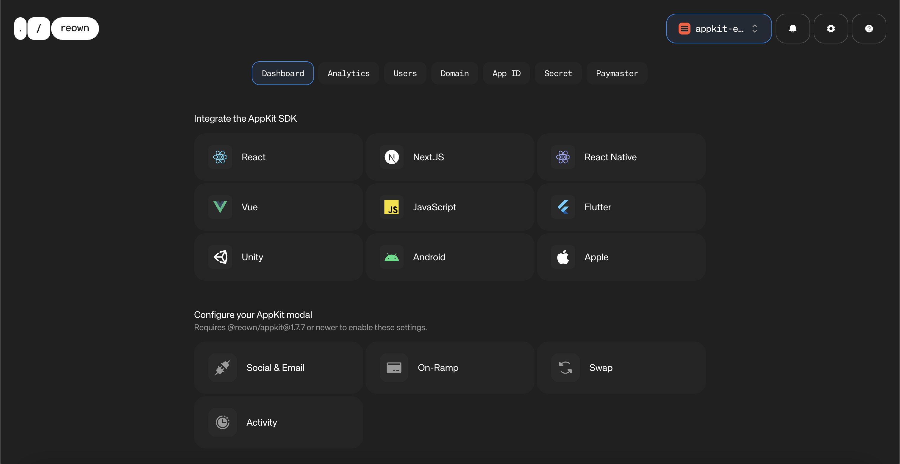
Scroll down, and at the bottom, you will be able to find your Project ID
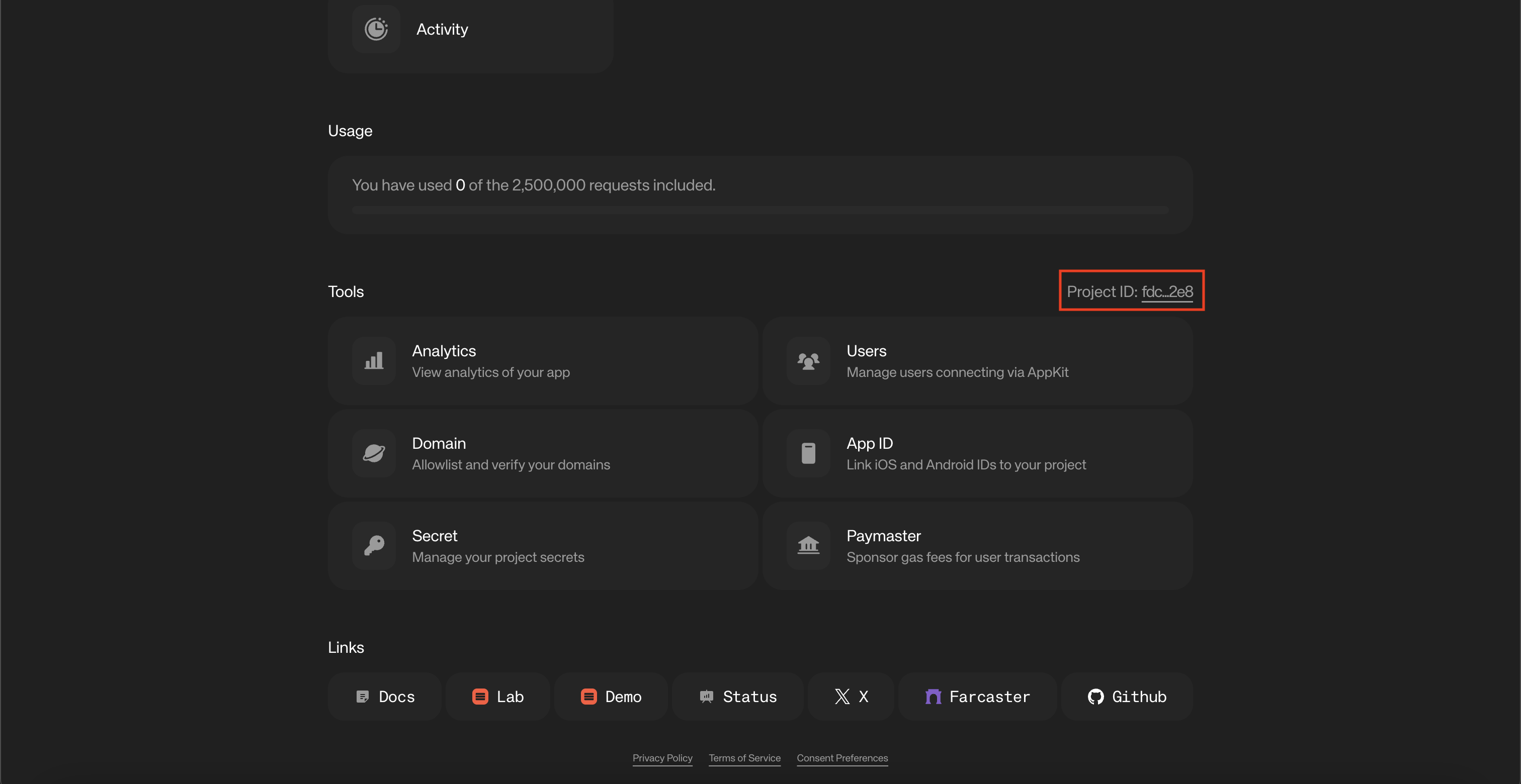
. Please copy that as you will need to configure this with Reown AppKit in your Web3 app.
AppKit Analytics
Now that your project is set up, let’s explore how you can leverage AppKit Analytics to gain deeper insights into the growth and performance of your Web3 app. With built-in metrics and user behavior tracking, Analytics helps you move beyond raw data and uncover the trends that truly matter.
Navigate to the “Analytics” tab on Reown Dashboard and click on “User Activity” to get started.
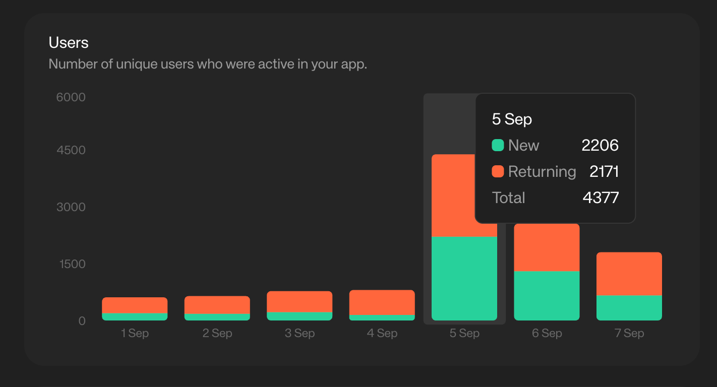
User Activity: Active users
This metric shows the number of unique users who were active in your app during a given time period. It’s one of the clearest indicators of overall growth, retention, and engagement.
💡 Inference
By tracking changes in active users, your team can measure the impact of product launches, marketing campaigns, or incentive programs (e.g., staking or airdrops) and quickly identify what’s driving real user adoption.
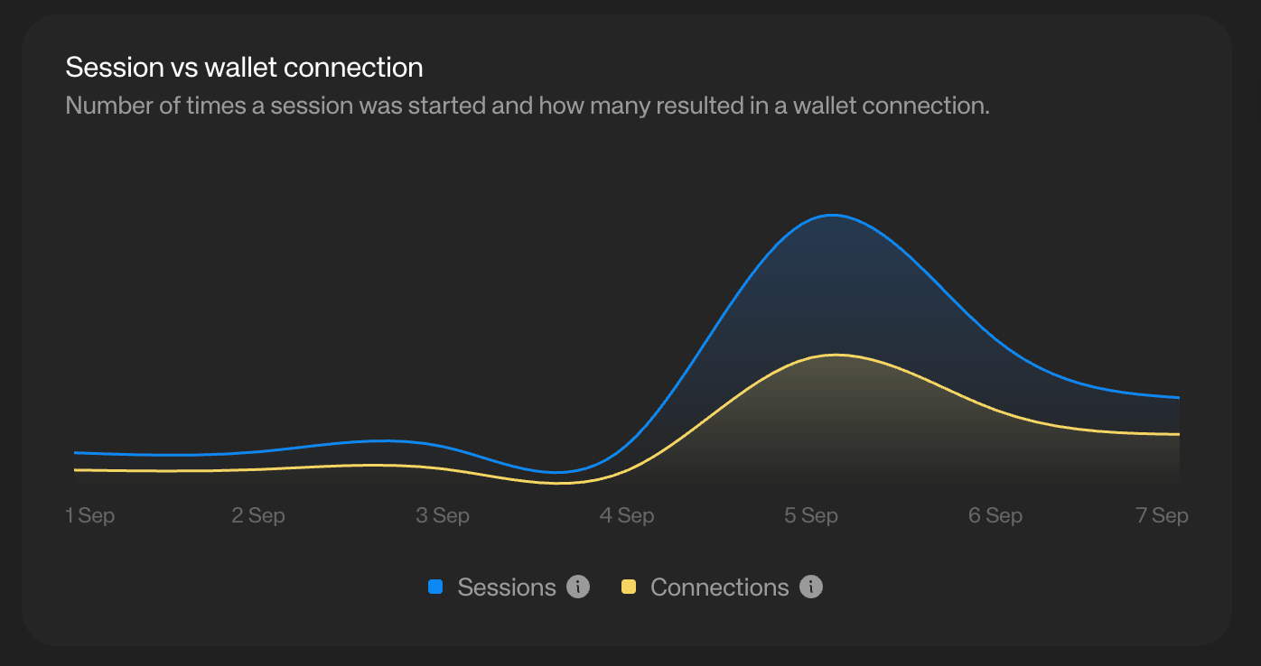
Session vs wallet connection
This metric compares the number of times a session was initiated with how many of those sessions actually resulted in a successful wallet connection. It highlights how effectively your app is converting user intent into meaningful engagement.
💡 Inference
A high drop-off between sessions and wallet connections may signal friction in the onboarding flow (e.g., unclear prompts, unsupported wallets, or technical errors). Monitoring this helps teams optimize the connection flow and improve overall conversion.
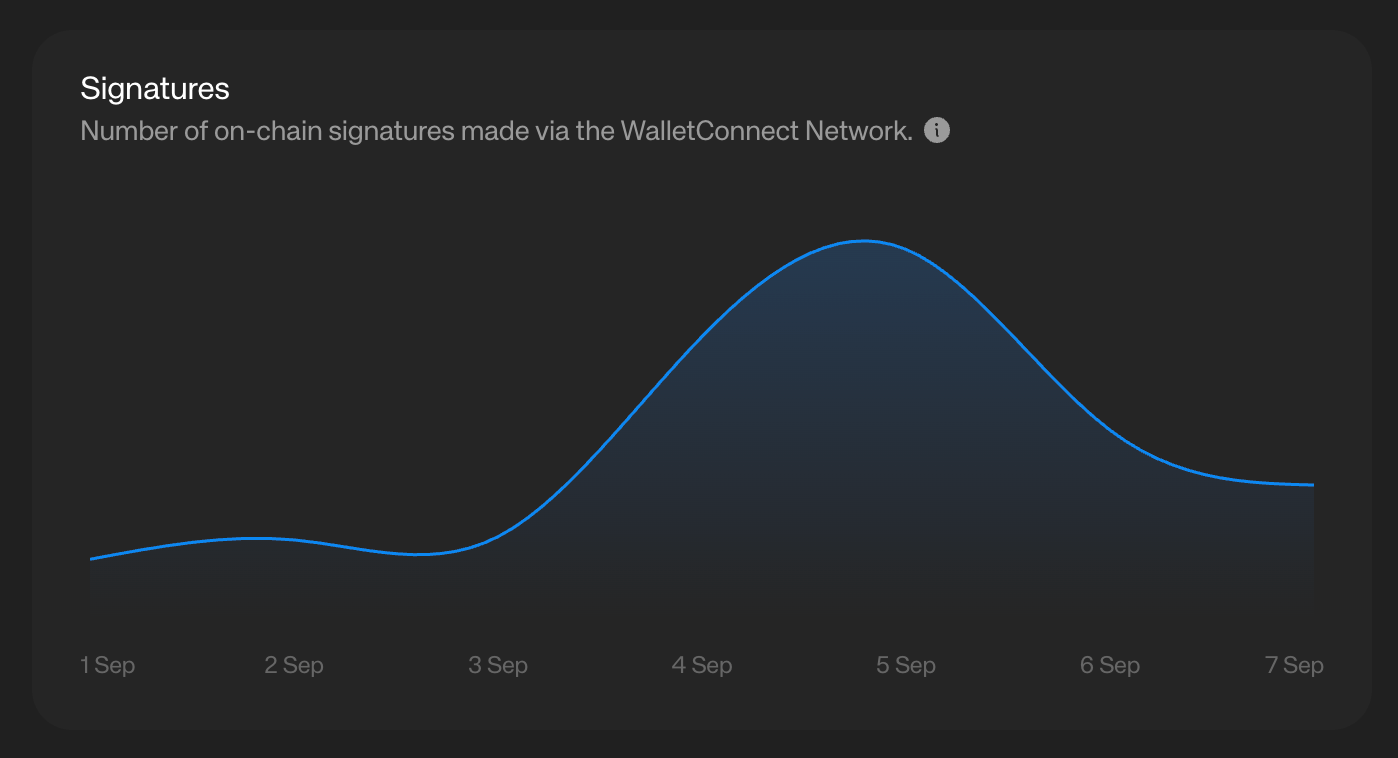
Signatures
This metric shows the number of onchain signatures made through the WalletConnect Network while users interact with your app. It reflects how actively users are engaging in onchain actions such as swaps, staking, or governance participation.
💡Inference
A higher volume of signatures indicates strong onchain engagement and can help teams assess the effectiveness of product features or incentive programs. Conversely, a low signature count may suggest that users are connecting but not meaningfully transacting, pointing to potential UX or product gaps.
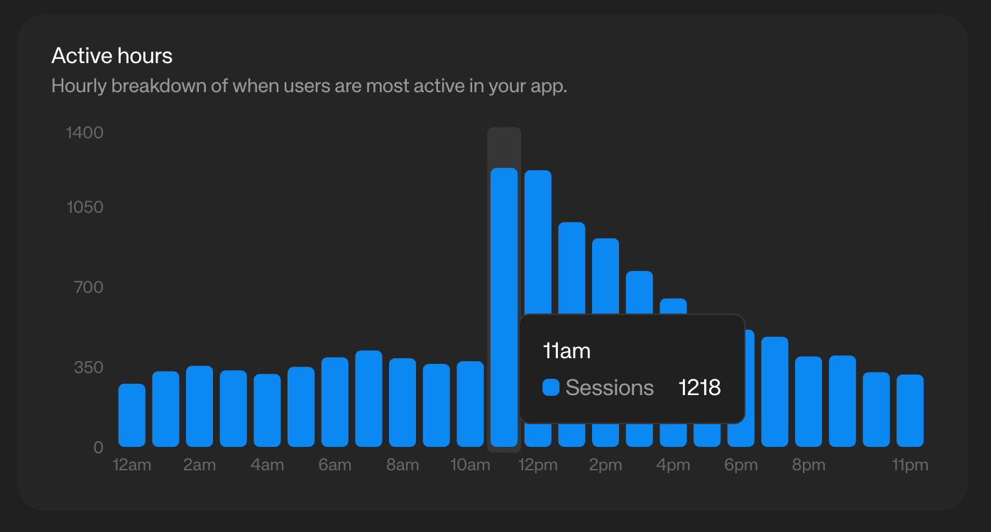
Activity Hours
This metric provides an hourly breakdown of when users are most active in your app. It helps you understand daily engagement patterns and identify peak usage times.
💡Inference
By knowing when users are most active, your team can schedule announcements, product launches, or incentive campaigns for maximum visibility and impact. It also helps optimize infrastructure resources during peak hours.
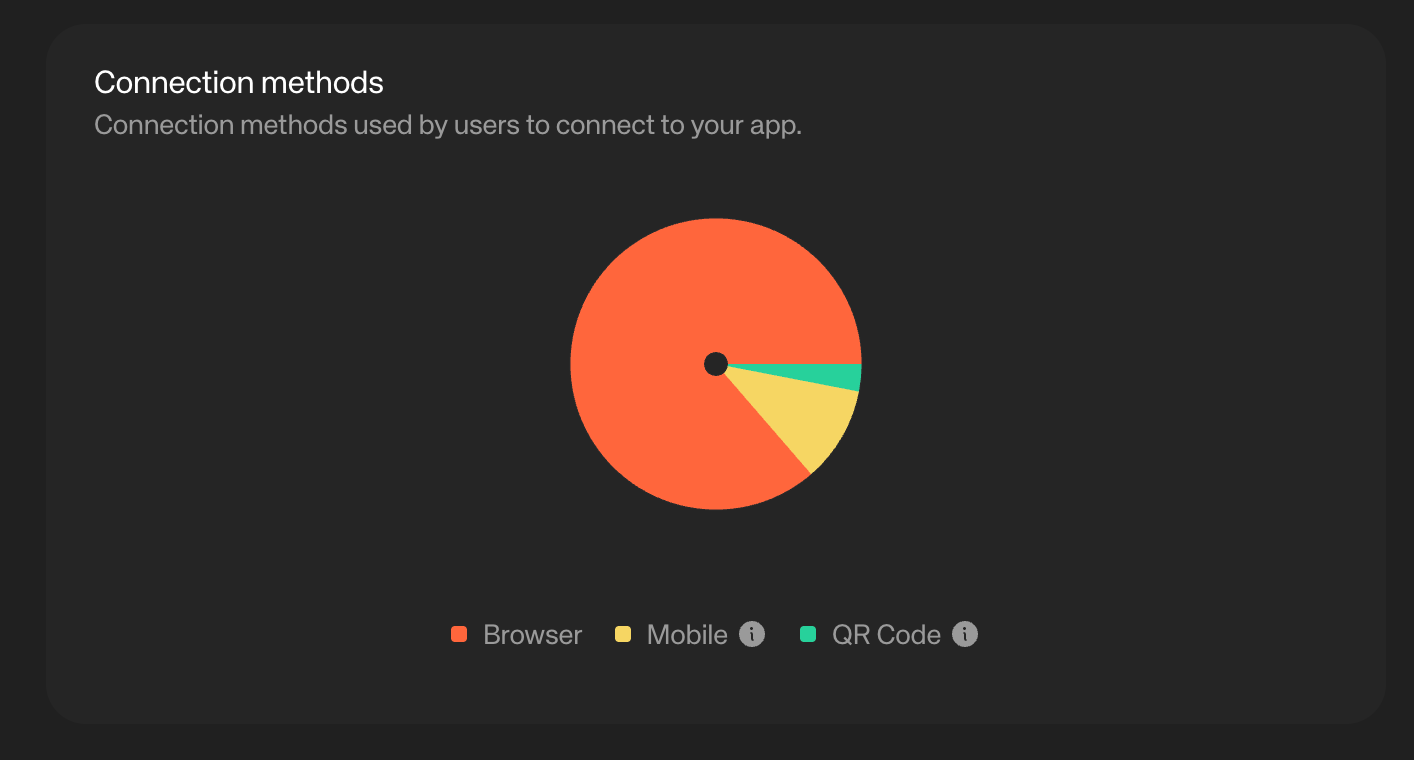
Connection methods
This metric shows the different methods users choose when connecting their wallets to your app (e.g., QR code, mobile deep link, or desktop extension). It highlights user preferences across platforms and connection flows.
💡Inference
Understanding which connection methods are most popular helps your team optimize for the preferred user journey, streamline the UX, and troubleshoot underused methods that may signal friction or technical issues.
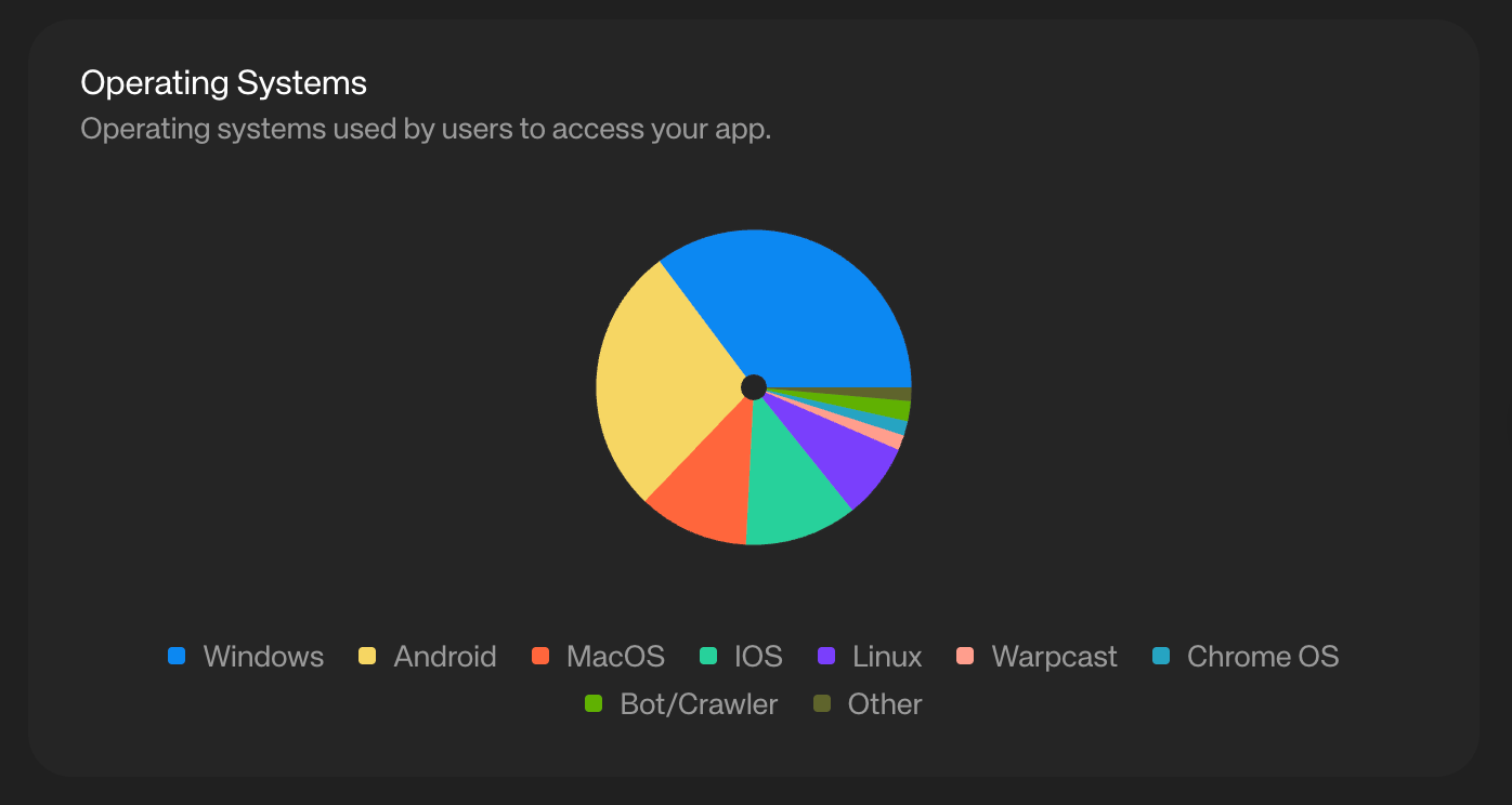
Operating systems / Platform Distribution
This metric shows the operating systems and platforms your users rely on to access your app — including Windows, Android, macOS, iOS, Linux, Warpcast, Chrome OS, bots/crawlers, and more. It provides a clear view of your user base’s technical environment.
💡 Inference
By knowing which platforms dominate, your team can prioritize support, optimize testing, and allocate resources where they matter most. For example, if iOS and Android lead, doubling down on mobile UX and performance becomes a clear priority.
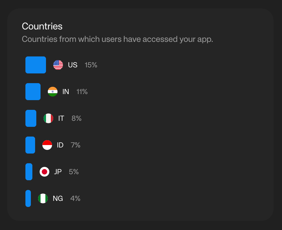
Country Distribution
This metric shows the geographic distribution of your users, highlighting which countries they are accessing your app from. It provides insights into where your app is gaining traction globally.
💡Inference
Tracking country distribution helps your team identify strong regional markets, tailor marketing or incentive programs to specific geographies, and prioritize localization or compliance needs where user adoption is highest.
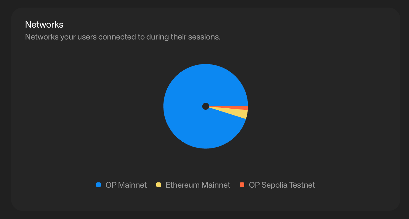
Networks
This metric shows which blockchain networks your users connect to during their sessions (e.g., Optimism Mainnet, Ethereum Mainnet, Optimism Sepolia Testnet, etc.). It highlights ecosystem preferences and usage patterns across chains.
💡Inference
Understanding network distribution allows your team to spot where adoption is strongest, decide which ecosystems to double down on, and plan future integrations. For example, a spike in Optimism Mainnet activity might suggest prioritizing Optimism-native features or incentives.
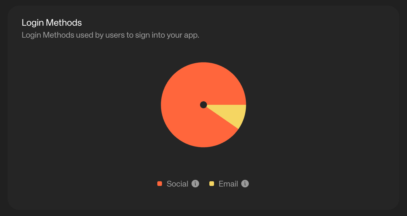
Login Methods
This metric shows the login methods users rely on to sign into your app, such as social accounts or email-based authentication. It gives visibility into user preferences for onboarding and account access.
💡Inference
By understanding which login methods dominate, your team can streamline the preferred flows, reduce friction for new users, and ensure backup options are reliable. For example, if most users prefer social logins, optimizing that flow becomes critical for retention and conversion.
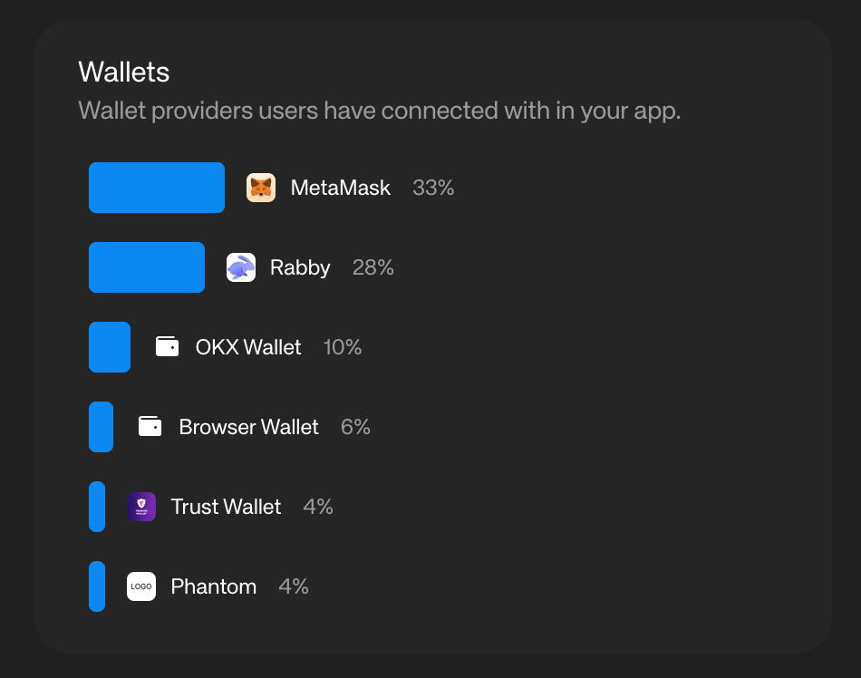
Wallets
This metric shows the different wallet providers users connect with in your app, such as MetaMask, Rabby, OKX, and others. It highlights which wallets are most popular among your user base.
💡 Inference
Knowing which wallets your users prefer helps your team prioritize compatibility, optimize testing, and even explore co-marketing or partnership opportunities. If a large portion of users connect via a specific wallet, ensuring a flawless experience there becomes a high-impact priority.
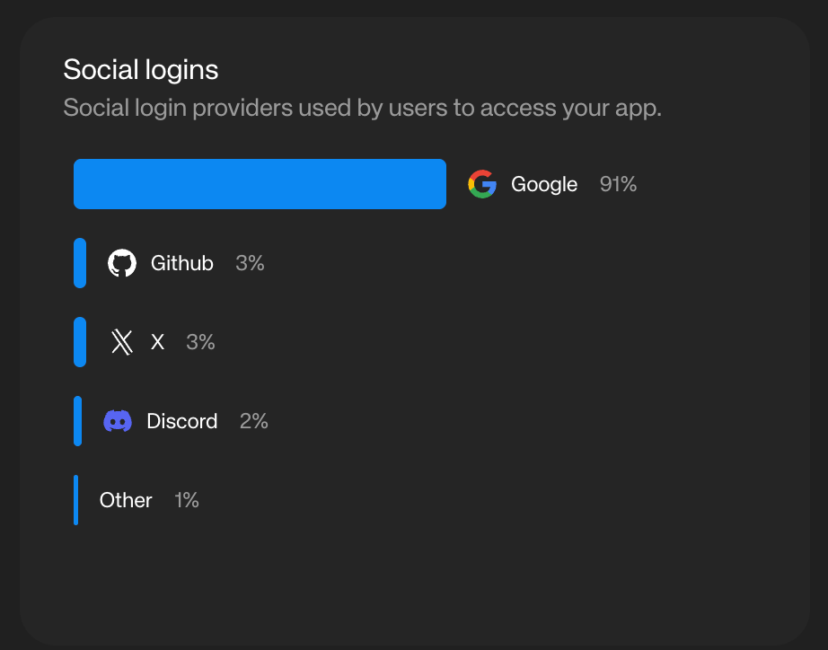
Social Login
This metric shows which social login providers (e.g., Google, Twitter/X, Discord, Github, etc.) users rely on to access your app. It provides insight into the most common identity providers within your user base.
💡 Inference
By understanding which social login providers are most popular, your team can optimize those flows, ensure reliability, and align engagement strategies with the platforms your users already trust and frequent. For example, if Discord logins dominate, it may be worth deepening community engagement on Discord.
Swaps Activity
Navigate to the “Analytics” tab on Reown Dashboard and click on “Swaps” to get started.
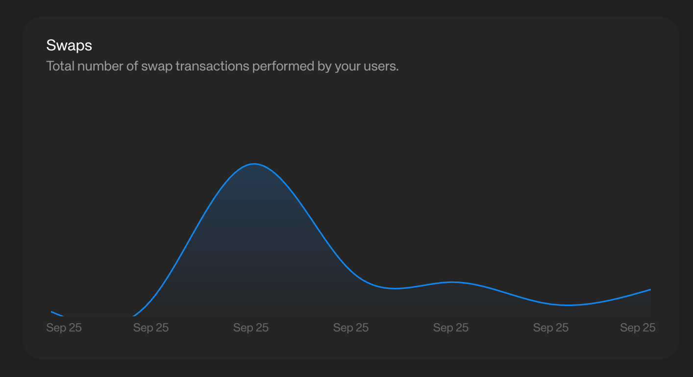
Swaps
This metric tracks the total number of swap transactions performed by your users within your app. It reflects how actively users are engaging in token trading or asset rebalancing.
💡Inference
A high swap count signals strong transactional activity and user confidence in your app’s trading features. Conversely, low swap activity may suggest friction in the swap flow, a lack of liquidity, or limited token pair availability, giving your team clear areas to investigate and improve.
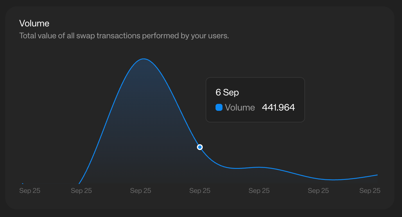
Volume
This metric measures the total value of all swap transactions performed by your users. It provides visibility into the overall trading activity and economic impact of your app.
💡Inference
Tracking swap volume helps your team assess the scale of user engagement and liquidity. High volume with relatively few users may indicate a strong base of power users, while low volume despite many swaps could suggest smaller trade sizes—both useful signals for shaping incentives and product strategy.
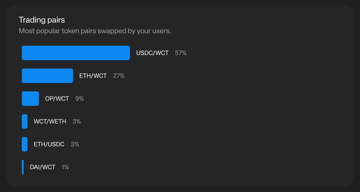
Trading pairs
This metric highlights the most popular token pairs swapped by your users (e.g., USDT/WCT, ETH/WCT, OP/WCT). It provides insights into trading preferences and liquidity demand within your app.
💡Inference
Identifying the most traded pairs helps your team prioritize liquidity support, improve pricing and routing for high-demand pairs, and design targeted incentive programs. If certain pairs dominate, it’s a signal to double down on liquidity provisioning and partnerships around those assets.
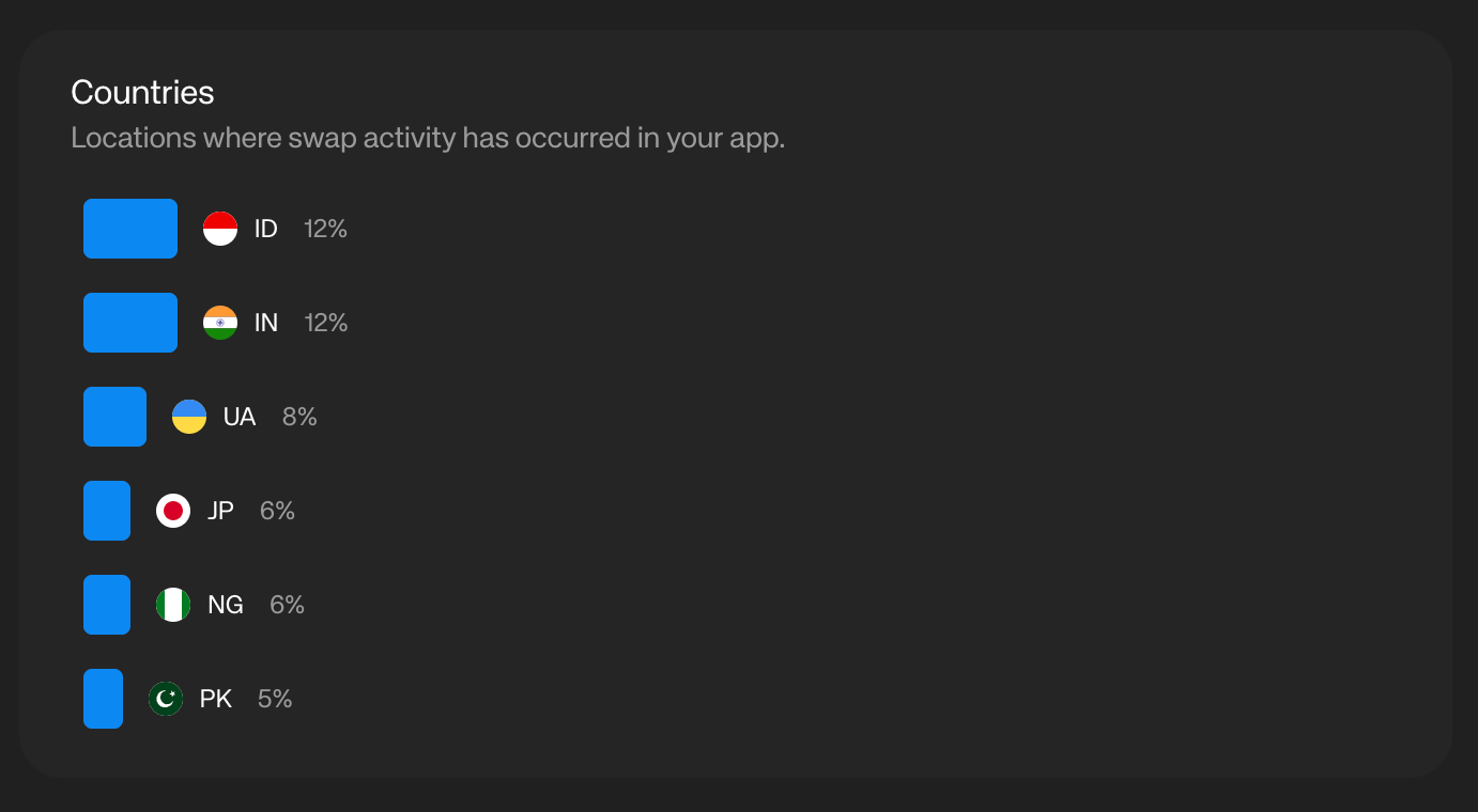
Countries
This metric shows the locations where swap activity has taken place in your app. It highlights the geographic spread of your trading user base.
💡Inference
Understanding where swap activity is concentrated helps your team identify high-value regions, tailor liquidity and incentive programs for those markets, and ensure compliance with regional regulations. For example, if a large share of swaps comes from Europe, prioritizing Euro-based stablecoin pairs may improve user experience.
Similarly, you get Analytics information for Onramp.
Users
Navigate to the “Users” tab on Reown Dashboard and click on “Overview” to get started.
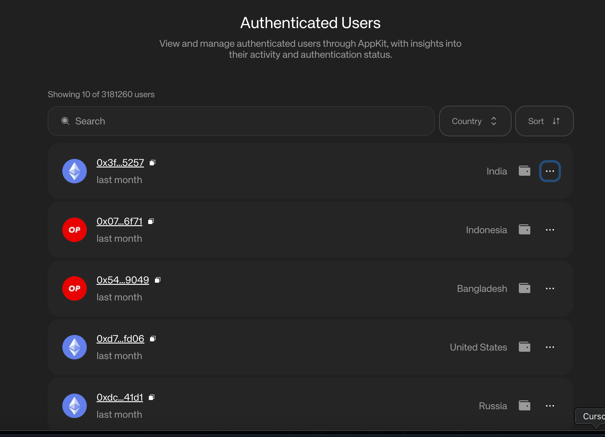
Authenticated Users
This section lets you view and manage authenticated users through AppKit, providing insights into their activity and authentication status. It helps teams monitor which users have signed in and how they’re engaging with the app over time.
💡 Inference
Tracking authenticated users enables your team to distinguish between anonymous and verified activity, measure the effectiveness of onboarding flows, and build more personalized experiences. For example, a steady rise in authenticated users signals stronger long-term retention and trust in your app.
Conclusion
Reown AppKit Analytics gives teams a clear, chain-agnostic view of how their users grow, engage, and transact. By combining insights across users, sessions, networks, wallets, and swaps, it eliminates the need for fragmented tools and custom tracking. With these metrics at hand, teams can make informed decisions, whether it’s optimizing onboarding, deepening ecosystem partnerships, or scaling infrastructure, ultimately driving sustainable growth for their Web3 apps.
What's Next?
If you're wondering how to use Reown for various use cases and build apps with great UX, feel free to check out our other blogs here.
Need help?
For support, please join the official Reown Discord Server.