How to Use Reown Analytics to Understand Your Users
Most DeFi teams know roughly how many users their app has. Fewer know who those users are, where they connect from, how they prefer to authenticate, what else they do onchain, or how much they're worth. That gap between traffic data and user understanding is where product decisions go wrong — features built for assumed audiences, marketing spend directed at the wrong channels, UX optimized for device types that don't match actual usage.
Reown Analytics closes that gap. Built into the Reown Dashboard, it gives you a clear, chain-agnostic view of your user base — from the countries they connect from to the wallets they hold to the other apps they're active in. If you're already using the Reown SDK, the data is already being collected. This article covers how to read it — and what to do with it.
Why Reown Analytics Is Built for Understanding Your Users
Most analytics tools tell you about traffic and events. Reown Analytics tells you about people — specifically, onchain people. Because it's embedded in the Reown SDK at the connection layer, it captures data at the moment a user connects their wallet: their geography, their device, their login method, their wallet provider, and the network they're on. No custom tracking events to configure. No third-party scripts to install.
At Pro tier, this extends to behavioral data: connection patterns, operating systems, wallet providers, and geographic breakdowns, with 7 days of history. At Enterprise, the picture becomes significantly richer: app co-usage data, onchain net worth segmentation, and Wallet Intelligence filters — giving you the ability to understand not just how users interact with your app, but who they are across the broader onchain ecosystem.
For a walkthrough of how to access each section of the dashboard, see Reown Analytics Explained. This article focuses on what each chart means for your decisions.
What Reown Analytics Tells You About Your Users
Where Your Users Are (Geographical Distribution)
The Countries chart under User Activity shows which markets your users are coming from, including all transactions. Each view is available separately, so you can compare geographic distribution across different types of engagement.

This is more than a vanity metric. If a significant share of your DeFi users are based in Southeast Asia, they're statistically more likely to be comfortable with QR code login flows and mobile-first UX than users in Western Europe, where browser extension wallets dominate. If your swap users are concentrated in Latin America, that's a clear signal to consider localising your app into Spanish and Portuguese and to prioritise stablecoin pairs relevant to those markets.
Geography also feeds compliance decisions. Concentration in specific jurisdictions may trigger licensing or KYC requirements that need to be in place before you scale. Reown's compliance tooling can help teams navigate those requirements without rebuilding authentication from scratch.
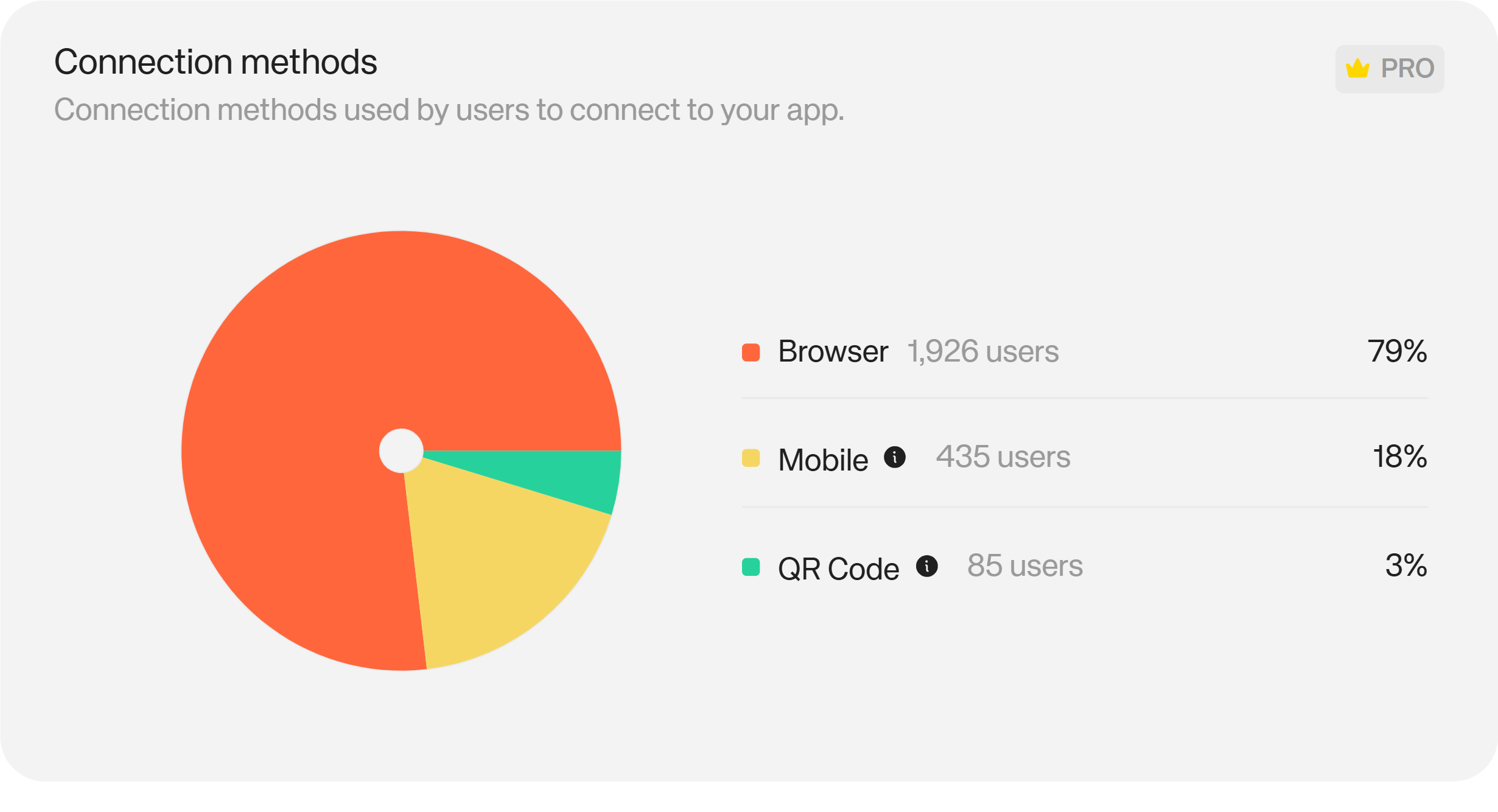
How Your Users Connect (Connection Methods and Operating Systems)
The Connection Methods chart shows how users are initiating their wallet connections: QR code scanning, mobile deep links, or desktop browser extensions.
The Operating Systems chart sits alongside it, breaking down the device environment: iOS, Android, Windows, macOS, Linux, Chrome OS.
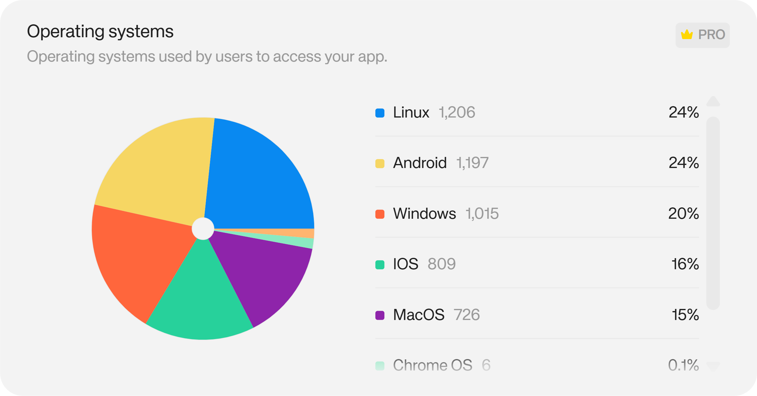
These two charts answer the same question from different angles: what does my user's actual environment look like? If 70% of your connections come from mobile, building UX optimised for desktop will produce a worse product for the majority of your audience. If QR code connections dominate, that's a connection flow you should be testing heavily and ensuring works flawlessly — not deprioritising in favour of other improvements.
A high drop-off rate between sessions started and wallets connected, read alongside connection method data, often reveals the root cause: a specific connection method with a UX or compatibility issue, rather than a general onboarding problem.
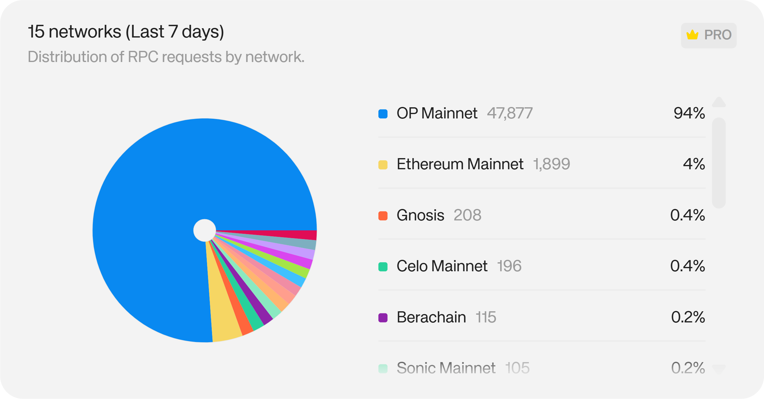
Which Networks and Wallets Your Users Prefer
The Networks chart shows which blockchains users are connecting to during their sessions.
The Wallets chart shows which wallet providers they're using — MetaMask, Rabby, OKX, Trust Wallet, and others.
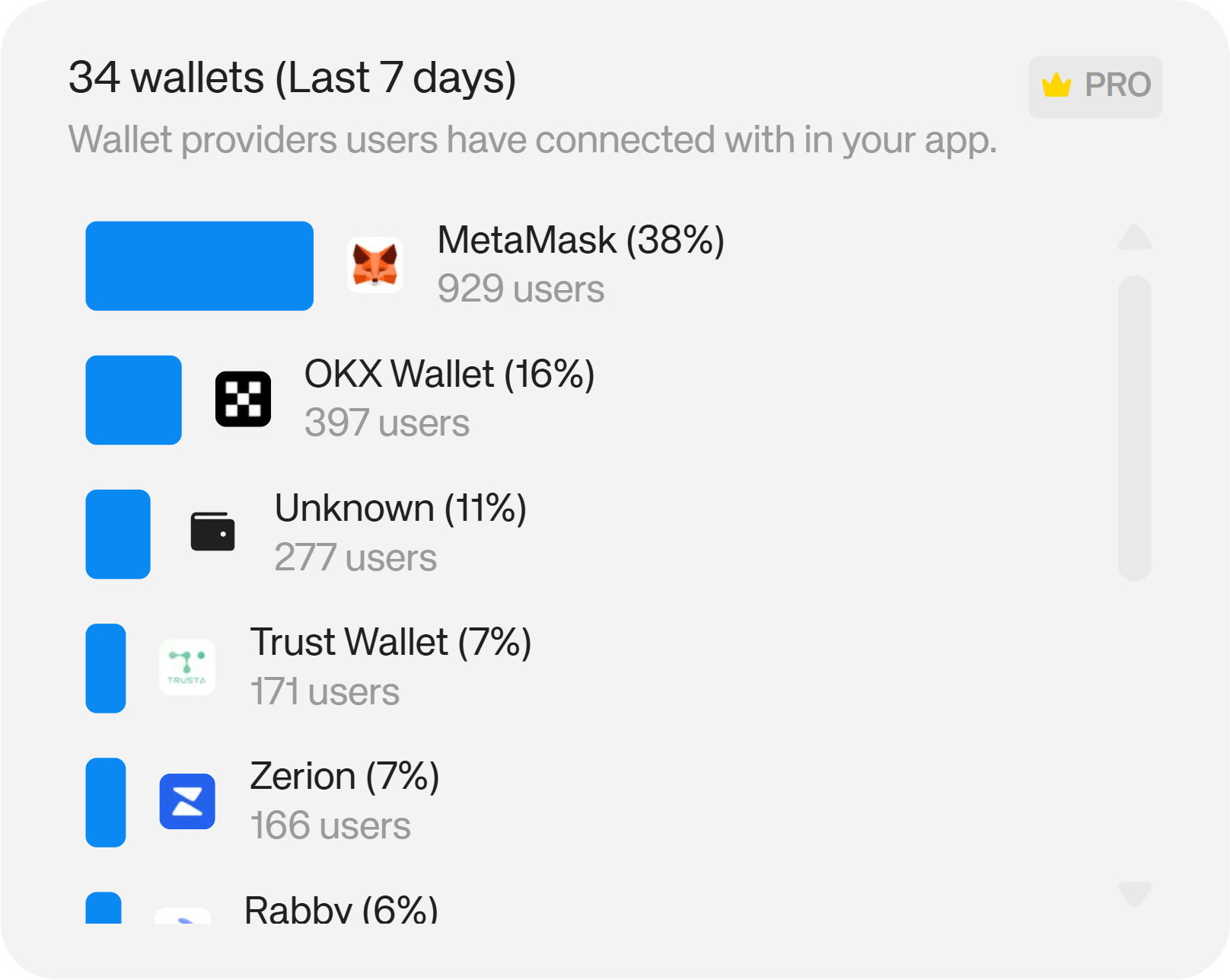
Both are directly actionable. If your users are concentrated on a particular network, ensuring smooth performance on that chain should be a testing priority. If a significant share of your users connect via a single wallet provider, a UX issue with that integration is a more serious problem than headline metrics might suggest — and a natural reason to invest in that relationship.
The same data surfaces partnership opportunities. Strong overlap between your user base and a specific wallet's community is a natural starting point for a co-marketing campaign, a joint incentive program, or simply a conversation about mutual visibility.
What Your Users Do Outside Your App (App Co-Usage and Net Worth)
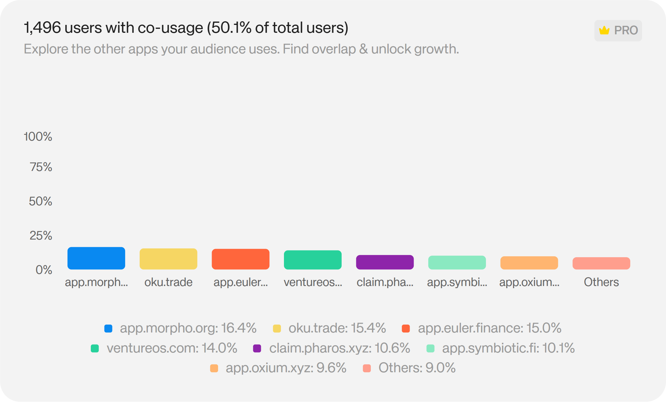
Available at Enterprise tier, the App Co-Usage chart shows which other onchain apps your connected users are active in — ranked by prevalence.
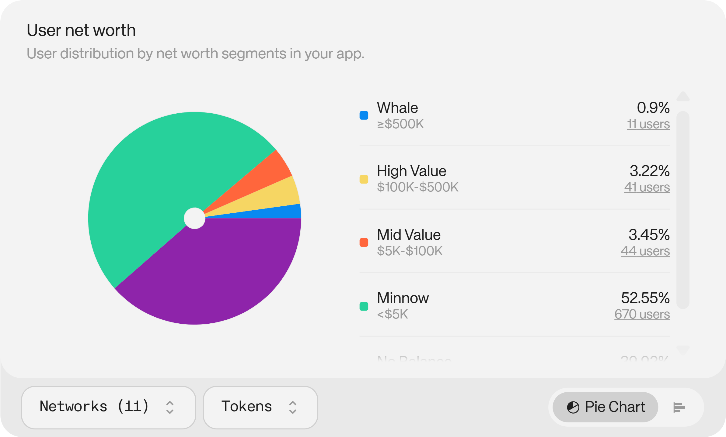
The User Net Worth chart segments your user base by their total onchain holdings, breaking each segment down by the assets those users hold.
These are the two most strategically valuable charts in the dashboard, because they tell you about your users beyond your own data. If the majority of your DeFi platform's users are also active in yield farming or lending protocols, you now know what features your audience is already comfortable with — and what they'd adopt if you built it. You don't need to rely on in-app signals or user interviews alone to understand demand.
Net worth segmentation takes this further. Knowing the distribution of your user base across wealth tiers (and knowing which assets those users hold) lets you identify your most important cohort and understand what attracts them. That's a foundation for acquisition strategy, product prioritisation, and understanding the ceiling of your monetisation opportunity.
Exploring Individual Users (Wallet Intelligence)
Also at Enterprise tier, Wallet Intelligence in the Users tab lets you go deeper into individual user profiles. You can filter your entire connected user base by country, onchain net worth segment, token holdings, and authentication status. Then you can click into any individual user to see their full onchain picture: the networks they hold assets on, the wallets they use, and a direct link to their blockchain explorer profile.
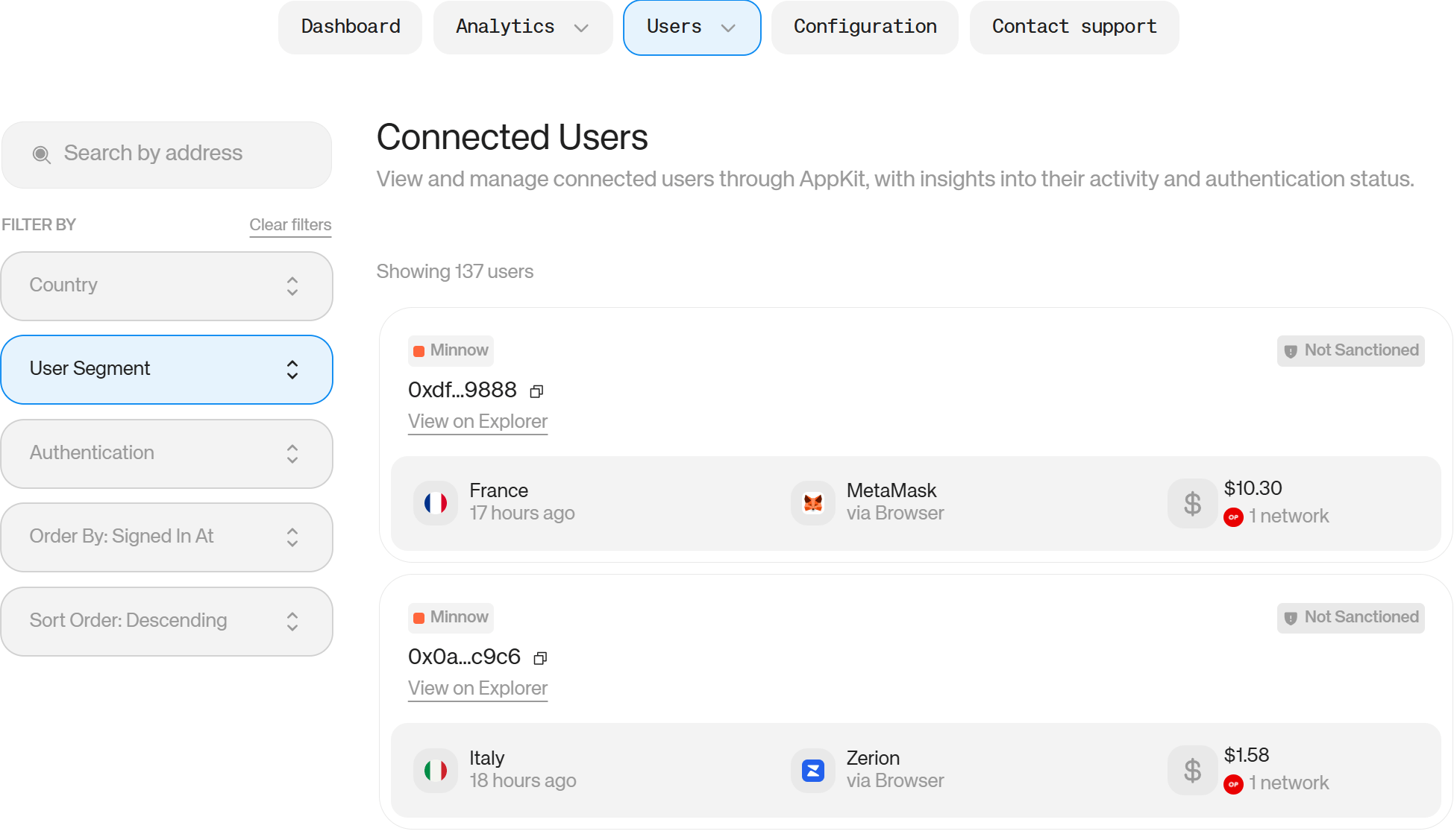
This works in two directions. For identifying high-value users, it lets you study the specific onchain profile of your most important users: what they hold, where they're active, and how to find more people like them. For compliance, it gives you the ability to identify sanctioned users and understand their behaviour on your platform before it becomes a regulatory issue.
How to Use Reown Analytics to Optimise Your Product for Your Actual Audience
Reading the geography, connection method, and OS data together gives you a clear picture of who you're building for and where your current UX assumptions are wrong.
A practical framework: identify your top three countries, your dominant connection method, and your most-used operating system. Then ask whether your current product is optimised for that combination. If your top market is mobile-heavy and QR-code dominant but your onboarding flow was designed for desktop extension users, that mismatch is costing you conversions on every session.
Use the data to prioritise: if mobile represents 60% of connections but only 40% of completed wallet connections, that's a conversion gap worth closing. If a specific OS shows higher-than-average drop-off between session start and wallet connection, that's a compatibility issue to investigate.
Reown's social and email login options, covering Google, Apple, Discord, GitHub, and others, are worth enabling if your login method data shows that a meaningful share of sessions end without a connection. Users without an existing wallet should have a path in.
How to Use Reown Analytics to Drive Marketing and Partnerships
The Networks and Wallets charts, combined with geographical data, create a targeting picture that most onchain teams don't have without expensive third-party tooling.
If a single wallet provider represents 30% of your connections, that provider's user community is a natural audience for co-marketing — whether that's a joint campaign, a co-branded incentive, or ensuring your product is featured in that wallet's ecosystem. The same logic applies to chains: strong concentration on a particular network often comes with an ecosystem team that has grants, co-marketing budgets, and an interest in apps actively serving their users.
The App Co-Usage chart (Enterprise) takes this further. If your users are disproportionately active in specific protocols, those protocols are natural partners. Shared audiences are the foundation of useful partnerships — and you now have data to identify them without relying on guesswork.
Geographic data also feeds paid and organic marketing decisions. Countries with a high share of swap or onramp activity but low overall user counts may represent undertapped markets with demonstrated intent — worth prioritising in content, localisation, or campaign spend.
How to Use Reown Analytics to Understand and Acquire High-Value Users
Net worth segmentation and Wallet Intelligence together let you do something most DeFi teams can only approximate: build a detailed profile of your most valuable existing users.
Start by identifying your high-net-worth cohort in the User Net Worth chart. Look at which assets they hold, which networks they're active on, and which other apps appear in their co-usage data. You're building a profile of the kind of user who finds your app valuable enough to commit real capital to.
That profile becomes a targeting brief. If your high-value users are disproportionately active in a certain ecosystem or hold a specific set of assets, those are the communities where acquiring similar users is most likely to work. You're not guessing at audience fit — you're reading it from your existing user base.
For teams with compliance obligations, the same Wallet Intelligence filters let you identify and monitor sanctioned users, understand their behaviour on your platform, and take appropriate action early — rather than discovering the issue during an audit.
Turning Analytics Insights Into Action
The risk with any analytics tool is that data becomes a report rather than a decision. A practical discipline is to tie each chart to a specific product or marketing question before you open the dashboard:
- Countries → Are we optimising for the right markets? Do our feature decisions reflect where our users actually are?
- Connection methods + OS → Is our UX optimised for the device and login flow most of our users are using?
- Networks + wallets → Are we testing on the right chains? Who should we be talking to for partnerships?
- App co-usage → What do our users want that we haven't built yet?
- Net worth + wallet intelligence → Who are our most valuable users, and how do we find more of them?
Reown Analytics doesn't give you answers to these questions directly: it gives you the data to answer them yourself. The teams that get the most from it are those that connect charts to live decisions, rather than reading them as a passive weekly update.
Start Building From Real Data
Understanding your users is the prerequisite for building products they keep coming back to. Reown Analytics puts that understanding inside the same dashboard you use to manage your app. No extra tooling, no manual data joins, no waiting on a data team.
If you're already on the Reown SDK, your data is there. Log in to your dashboard to start exploring your user base. For teams that want the full picture including app co-usage, net worth segmentation, and Wallet Intelligence, get started with Enterprise.